

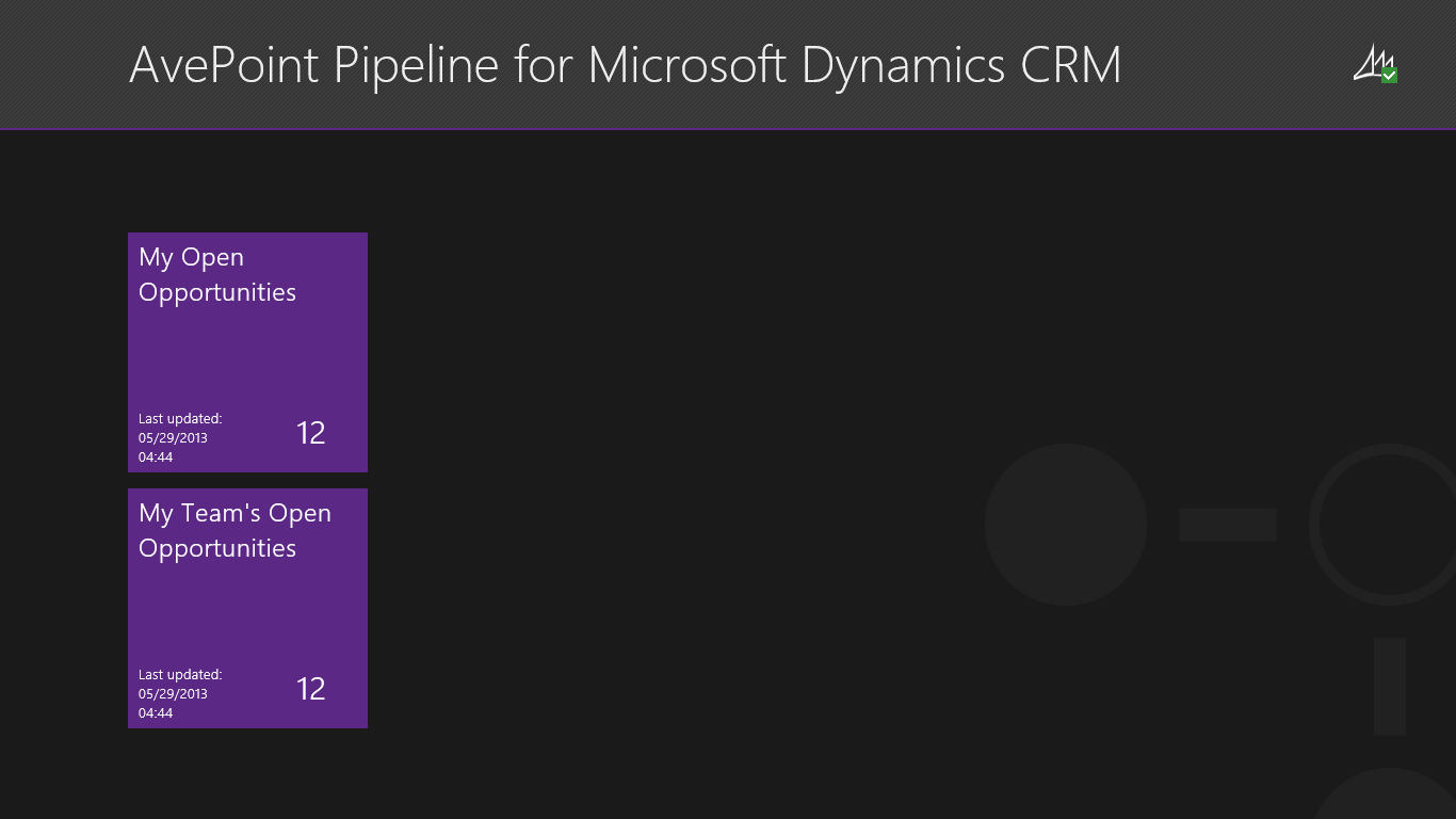
 Figure 1: Hub page
 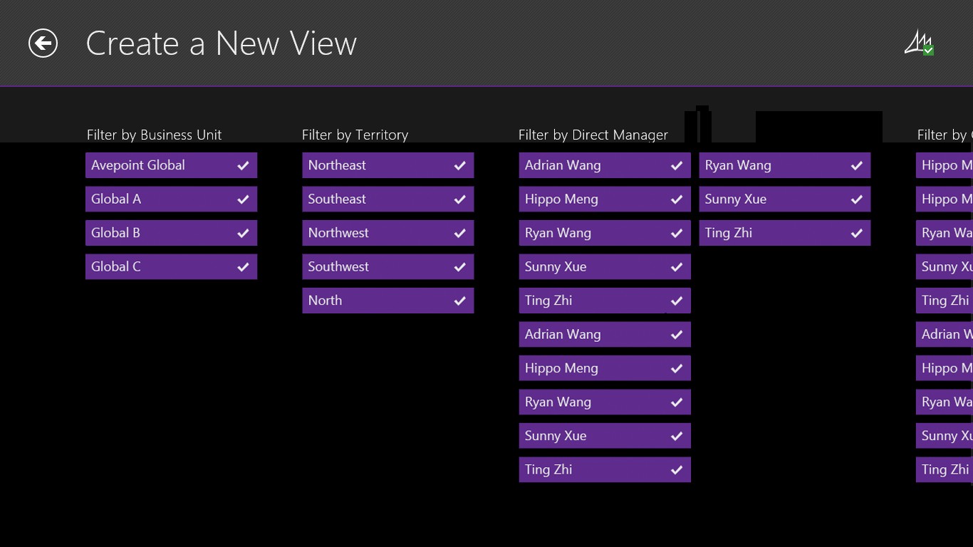 Figure 2: Create a New View page The Content page features a navigable opportunity section on top and interactive diagram with opportunity adjustment functionality on the bottom. Users can view the opportunity name, probability, as well as estimated revenue and close date in the opportunity tiles. In the diagram, the X-axis features a navigable timeline with today’s date highlighted. The Y-axis represents the probability. In the main area of the graph, opportunity entities are represented by circle graphics. The size of the circle represents the opportunity’s estimated revenue, the X-axis location represents the estimated close date, and the Y-axis represents the probability. The yellow box contains the “weighted amount” and “actual amount” of the opportunities located in the box. The user can adjust the size and position of the box by using the slider. We support the selection of single and multiple opportunities in two ways: swiping the opportunity tiles as well as clicking/tapping the screen selects all of the opportunity circles located in the affected touch area. The user deselects the opportunity easily by activating the action command that says “Clear Selection” in the app bar or by clicking/tapping the empty border around the diagram. We use color to map the selection stage and the “in the box” state. For example, a purple circle and tile with a white border is in the selected state while a yellow border is for the “in the box” state. The user adjust the estimated close date of the selected opportunity by dragging the slider on the timeline and adjusts the probability via a slider in fly out pane when activating the “Adjust Opportunity” action command in the app bar.
 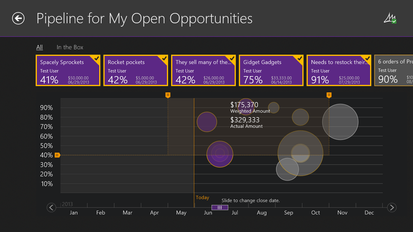 Figure 3: Content page The user can drill down for more detail on the opportunity by clicking or tapping the opportunity tile. Detailed information includes: · Opportunity name · Probability · Estimated revenue · Estimated close date · Weighted revenue · Total tax · Line items including product name, quantity, unit price, and total price The user can go directly to Dynamics CRM by clicking or tapping the Dynamics logo in the bottom right corner.
 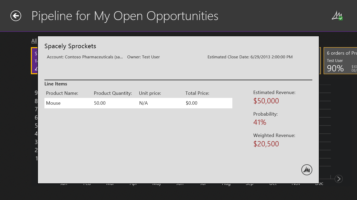 Figure 4: Opportunity detail pop up page The App bar is used to present commands and tools. They are hidden by default and appear when people swipe a finger from the bottom or top edge of the screen. The commands we included in the app bar include: · Undo previous action · Adjust opportunity · Clear selection · Switch between Pipeline and Preview Modes · Sort opportunity by name, amount, date, and owner · Change time range Users can also view summary information such as a comparison between total amount and weighted amount by months.
 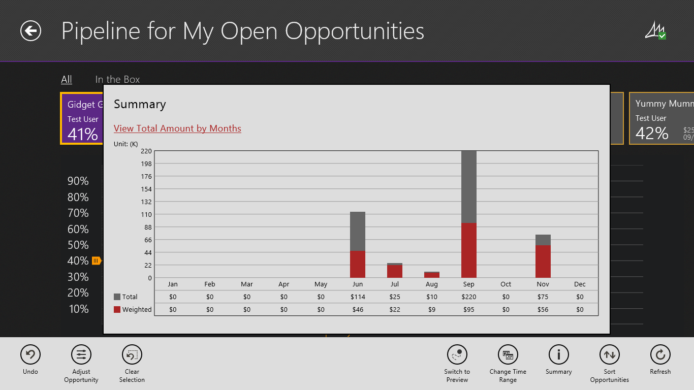 Figure 5: Summary fly out panel with app bar Summary As a powerful, elegant, and easy-to-use solution, Pipeline incorporates top notch features and functionality with advanced technology into a simple, intuitive form to assist the user in achieving his or her goals while improving productivity. Instead of a discrete one-time activity, design is an ongoing effort and process of continually studying users, examining the established features and functionality, and observing the user’s interactions and behaviors, as well as collecting feedback through usability testing. Want to try Pipeline yourself? Download the app for free in the Windows Store today! Interested in more solutions for Dynamic CRM? Read my previous blog post on AvePoint Timeline.